We get this comment a lot when people receive their orders: “These cushion covers look more expensive than they cost.” At first, we weren’t sure if that was a compliment or confusion about our pricing. But after hearing it dozens of times – we started paying attention to what they meant. It’s not that people expected cheap quality. It’s that certain design choices, certain details, certain ways of finishing a piece signal “luxury” to our eyes. And when those elements are present, the perceived value shoots up, regardless of the actual price tag. Here’s what we’ve learned about making spaces look expensive through cushion covers. Not by spending more – by choosing smarter.
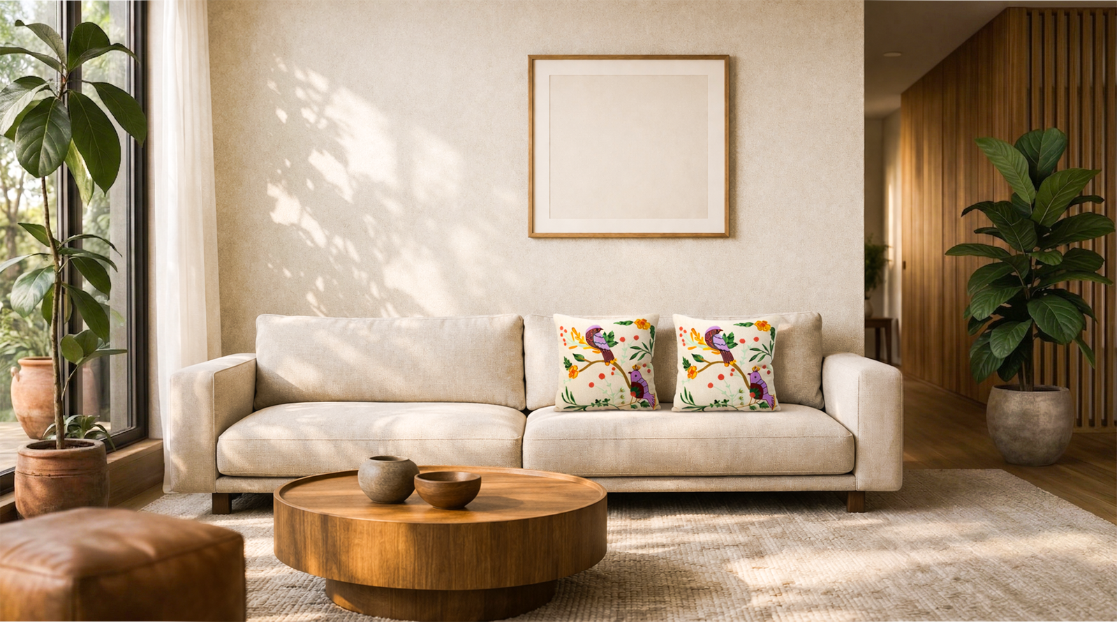
We get this comment a lot when people receive their orders: “These cushion covers look more expensive than they cost.”
At first, we weren’t sure if that was a compliment or confusion about our pricing. But after hearing it dozens of times – we started paying attention to what they meant.
It’s not that people expected cheap quality. It’s that certain design choices, certain details, certain ways of finishing a piece signal “luxury” to our eyes. And when those elements are present, the perceived value shoots up, regardless of the actual price tag.
Here’s what we’ve learned about making spaces look expensive through cushion covers. Not by spending more – by choosing smarter.
1. Traditional Botanical Embroidery
There’s something about classic floral embroidery that immediately reads as “quality.” Maybe it’s because we associate it with heirloom pieces. Or because we know how much time hand-stitching actually takes. Whatever the reason, it works.
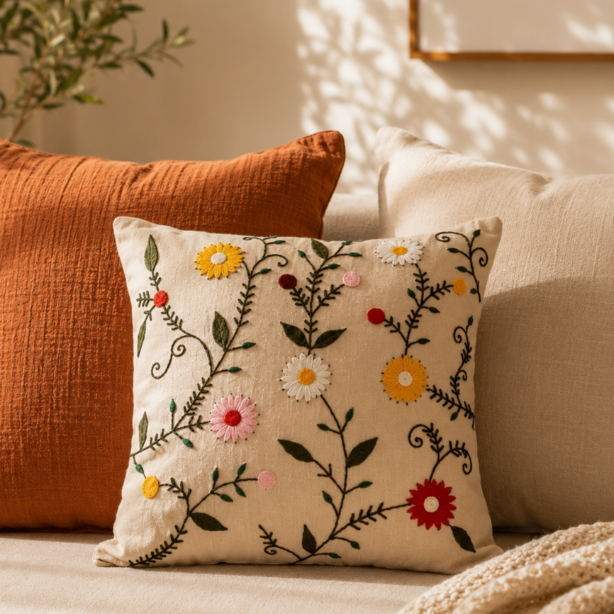
Our Sunset Blooms design leans into this completely. Hand-embroidered florals in terracotta, slate grey, and chocolate brown on natural cream cotton. The pattern itself is timeless.
But here’s what actually makes it look expensive: the embroidery technique. We use chain-stitch work that creates raised surfaces. Each petal has dimension. The swirling vines catch light. When you touch it, you feel the texture immediately.
The finishing detail that matters: Piped edges. That slim line of contrasting fabric around the perimeter. It’s a small thing, but it signals that someone thought about how this piece ends, not just how it looks from the front.
Where it works: Grey and beige sofas especially. The warm earth tones add richness without overwhelming. Also excellent on beds as a layering piece with white linens.
2. Large-Scale Floral Statements
Interior designers have known this forever: go big or go subtle. The middle ground, medium patterns at medium scale, is where things get forgettable.
Whispering Gardens is our “go big” piece. Oversized blooms in terracotta and slate-blue with delicate scrollwork. The flowers are genuinely large—maybe 5-6 inches across when embroidered. They command attention in a room.
What keeps it from feeling overwhelming? Two things. First, the ivory background gives the eye places to rest. Second, the chain-stitch embroidery creates these beautiful shadows and depth, so even though the pattern is bold, it has nuance.
We added pom-pom trim to this one, which was a risk. Pom-poms can read as cheap or childish if not executed carefully. But in the right scale and color, they add a tactile luxury that you find in high-end textile work. It’s a finishing touch that says “custom” rather than “mass-produced.”
The finishing detail that matters: Layered, three-dimensional petals. Some embroidery lies flat against the fabric. This rises from it, creating actual depth you can see from across a room.
Where it works: Modern spaces that need warmth. Contemporary homes with clean lines. Anywhere you want one standout piece rather than lots of competing patterns.
3. Naturalist Sketches with Embroidered Accents (The Collected Piece)
Expensive homes often have that “collected over time” quality. Like the owners traveled, found beautiful things, brought them back. You can create that same feeling without the passport stamps.
Crimson Cardinal gives you this effect. Detailed red cardinal birds embroidered with intricate feather work, set against sketched botanical illustrations in charcoal and olive green. It looks like someone took a page from a Victorian naturalist’s journal and turned it into textile art.
The finishing detail that matters: The combination of embroidered elements with printed sketches. Mixing techniques creates complexity that single-method pieces can’t match. Your eye reads it as “layered” and “considered.”
Where it works: Studies, reading nooks, any space where you want to suggest quiet sophistication. Particularly effective on cream or white upholstery where the red birds really pop.
4. Folk Art with Contemporary Colors
Folk embroidery traditions exist across India, from Kashmir to Karnataka. But traditional color palettes don’t always work in modern homes. That’s where contemporary interpretation comes in.
Songbird Serenade takes classic folk art embroidery techniques (chain-stitch, the flowing organic layouts) and updates the colors. Purple and wine-colored birds with coral berries and emerald leaves on natural cream. It honors the tradition while fitting current aesthetics.
This balance is what makes pieces look expensive. It suggests someone who understands design history and knows how to make it work today. Not copying, not ignoring, but translating.
The finishing detail that matters: The color combination. Purple and wine with coral and emerald isn’t a palette you stumble into by accident. It’s sophisticated and slightly unexpected, which reads as “curated.”
Where it works: Eclectic homes, spaces with global influences, anywhere you want to add character without pattern overload. The cream background keeps it versatile.
5. High-Contrast Drama
Sometimes expensive means confidence. And confidence means contrast.
Twilight Garden is our most dramatic piece: white daisies with golden centers hand-embroidered on Blue. High contrast, bold, but executed with enough restraint that it feels sophisticated rather than harsh.
Dark Blue cushions can go wrong easily. They can feel heavy, Gothic, or just out of place. The key is balancing with nature-inspired motifs and metallic accents. The white florals soften the dark. The golden centers add warmth. Emerald green leaves ground it in the organic world.
The embroidery creates different textures across the surface, smooth, dimensional white petals, the subtle sheen of green silk thread for leaves. That textural variation is crucial.
The finishing detail that matters: The concealed zipper. When you can’t see any hardware or closure, the design stays uninterrupted. It’s a small detail that signals quality manufacturing.
Where it works: Modern interiors, as an accent on grey or white sofas, anywhere you want a punctuation mark. Use sparingly, one or two in a collection.
6. Warm Earthy Tones with Organic Patterns
There’s a reason earth tones feel expensive, they’re harder to get right than bright colors. Too muddy and they look dull. Too orange and they feel dated. The sweet spot is narrow but powerful.
Rustic Meadow hits this balance. Burgundy blooms with olive green vines on natural cream, using traditional embroidery techniques. The color palette evokes autumn harvests, vintage textiles, heritage pieces that have been loved for decades.
What makes this work is the restraint. The pattern flows but doesn’t overwhelm. The burgundy is deep and wine-like, not bright red. The olive is muted, not Kelly green. Everything sits in that rich, saturated-but-subtle zone.
The finishing detail that matters: Dimensional stitching that creates shadows. When light hits embroidery at angles, you get these subtle depth cues that your brain registers as “handcrafted” and “quality.”
Where it works: Brown and tan sofas especially, it echoes and enriches their warmth. Also beautiful in traditional, farmhouse, or bohemian spaces. Anywhere “cozy” is the goal.
7. Soft Meadow Florals
Not all expensive-looking pieces shout. Sometimes luxury whispers.
Pastel Petals is proof. Chain-stitch embroidery in dusty pink, sage grey, mustard gold, and chocolate brown on cream cotton. Soft, muted tones. Flowing stems with varied blooms that feel meadow-inspired and organic.
This is the hardest aesthetic to nail, “effortlessly elegant.” It requires tremendous restraint. Each flower is individually embroidered with different petal shapes, creating natural variation. Nothing is perfectly symmetrical. Nothing is overly bright. It looks like it just… belongs.
The rectangular shape works beautifully here for layering. Placed horizontally across a sofa or against the arm, it adds depth without bulk.
The finishing detail that matters: The “imperfect perfection.” Stems curve slightly differently. Blooms face various directions. It mimics how wildflowers actually grow, which is harder to execute than geometric precision.
Where it works: Minimalist spaces, Scandinavian interiors, bedrooms, anywhere you want calm without sterility. Perfect for people who find bold patterns overwhelming.
The Real Transformation
At the end of all this, cushion covers are still just cushion covers. They’re not going to solve deeper issues with space. They won’t make an uncomfortable sofa comfortable or turn a dark room bright.
But what they can do, what we see them do constantly, is shift how a room feels.
From fine to warm. From new to lived-in. From “I just moved here” to “this is home.”
And sometimes, that shift happens through something as specific as embroidered cardinal birds on cream cotton. Or burgundy vines with dimensional stitching. Or oversized blooms that catch afternoon light.
The expensive-looking part? That’s just what happens when craft meets thoughtful design. When someone takes time to embroider each petal individually. When colors are chosen carefully. When finishing details aren’t skipped.
It’s not about tricking anyone into thinking you spent more than you did. It’s about choosing pieces that honor the craft that went into them. That shows quality when you look closely.
Because that’s what “expensive” really means in the end, not the price, but the care.
Warning: Attempt to read property "taxonomy" on false in /home/u918936160/domains/perfectlydwell.com/public_html/wp-content/plugins/elementor-pro/modules/woocommerce/classes/products-renderer.php on line 173
Warning: Attempt to read property "taxonomy" on false in /home/u918936160/domains/perfectlydwell.com/public_html/wp-content/plugins/elementor-pro/modules/woocommerce/classes/products-renderer.php on line 173
Whispers of Elegance
Step into a world where opulence speaks softly, where every element whispers sophistication and refinement. Quiet luxury interior design transcends the ostentatious, embracing a serene aesthetic that exudes understated elegance. In this article, we delve into the realm of understated opulence, uncovering the subtle nuances and impeccable craftsmanship that define this timeless style. Discover how minimalist sensibilities, premium materials, and meticulous attention to detail come together to create spaces that speak volumes in their hushed tones. Join us on a journey where luxury speaks softly but leaves an indelible impression.

Visit More -
Get fresh home inspiration and helpful tips from our interior designers